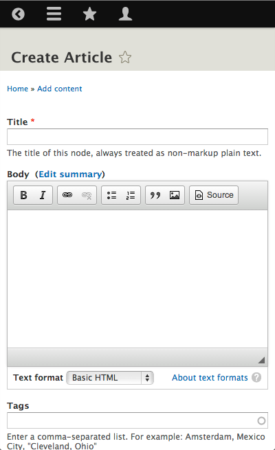
Drupal 8's out-of-the-box mobile friendliness creates quite the buzz. "Mobile friendly," "responsive," "squishy" — all words to describe the behavior a site invokes on different devices or different screen sizes. Mobile friendly can also mean content first. From a big screen to a little screen, things look different. Images change sizes, menu items become drop-downs, columns are pushed around to locations that make sense with content being the supreme real-estate. So if Drupal is mobile friendly out of the box that must mean I am 100% good to go with all my websites using Drupal 8. We wish. Drupal 8 is coming along and looking pretty sweet, but it is still Drupal and not a magic unicorn. This blog post is not going to get into the nitty gritty of how responsive websites work, but we're going to take a closer look at how two new core modules can make it easier to build a responsive theme.

Stock Drupal—Drupal after a fresh install using Bartik and Seven for the admin theme with no content whatsoever—certainly is magical on mobile devices. We can finally manage our sites on our iPhones or Android tablets without pulling our hair out. As long as we are just adding text as content, then, yes, we are good to go. But we all know we want to much more than that. Heck, we almost certainly are not going to be using Bartik. So now what?
Drupal core comes with two handy modules that are making lots of this responsive behavior possible: Breakpoint and Responsive Image. With a basic install only Breakpoint is enabled. The reason this is enabled by default is because the new admin toolbar at the top of the page is utilizing it to be responsive.
Breakpoint module gives us the ability to make our site change at different sizes. This doesn't necessarily instantly make your site responsive. Breakpoint simply gives you a nice built-in way to identify and use your breakpoints. The real work that still needs to be done is in your theme itself, which requires time by a front end developer and a site builder to actually create a responsive theme.
While we have a nice way to define breakpoints for our theme, we still need to do something about all our images. Responsive Image module is a module that comes with core but is not enabled by default. During the process of developing Drupal 8 and adding features, this module has had other names along the way before settling on Responsive Image. One of those previous names was Picture because it uses the HTML5 "picture" tag. Responsive Image module requires Breakpoint, as it uses the breakpoints that are coded into the theme along with image styles to re-size the images appropriately. Much like Breakpoint though, just enabling it doesn’t cause magical things to happen with your images on the site. There is still configuration that must be set up, but unlike Breakpoint there is a user interface to do your configuration. The video below will walk us through setting up responsive images on our Drupal 8 site.
Comments
Thanks for the overview! I think it would be good to be mention that there is a technological gap between breakpoints as managed within drupal for site builders to configure responsive images for example and front-end developer driven breakpoints that are usually configured CSS/Sass.
Greetings,
Dasjo
responsive image are inactive by default instalation,
Add new comment