Flexible and fluid layouts such as those based on percentages instead of pixels are great for rendering column-based web pages on a variety of sizes of monitors and even larger tablets. However, if a person were to view such a page on a much smaller screen, like that of a smartphone, they will get horizontal scrollbars. This is because the device's resolution is much larger than the width of the device, closer to that of a traditional desktop monitor or laptop, in fact. As as result, the person viewing the page has to pan and zoom to access the content of the page. The phone's screen serves merely as a "viewport" through which the person may view a web page at a higher resolution than the dimensions of the device.
For the web designer, who, for example, has set an outermost container to 90%, that is being honored. However the result for us and other users is still not ideal (i.e. those dreaded horizontal scrollbars). What we want is for the smartphone's browser to render the page at the device's width, not some larger resolution. For that, we'll need to put a viewport meta tag in the head of our HTML pages and specify some particular values for it.
This is a critical step in the process of creating a responsive Drupal theme; because, until this is done, we won't see any pay-off for our flexible layout and we can't really move forward with other responsive design strategies, such as implementing media queries to provide different layouts at different viewport sizes.
This tutorial, based on the free video Adding the Viewport Meta Tag to html.tpl.php, expects that you have a basic to intermediate understanding of:
- Working with and editing files of a Drupal site (i.e. copying files, navigating your site's files, editing and saving a file)
- The basics of working with template files in a Drupal theme
- How to find the head element of an HTML document
Hands On
- Check to see if your theme has an html.tpl.php template file. In your file system, navigate to sites/all/YOUR_THEME and check to see if an html.tpl.php file already exists.
- (Skip this step if your theme already has an html.tpl.php file.) In your file system, navigate to the root of your Drupal site. Copy modules/system/html.tpl.php and paste into your theme's root directory. For example, my theme is called "responsiverobots" and so I copied modules/system/html.tpl.php to sites/all/themes/responsiverobots/html.tpl.php. (If you have a "templates" sub-directory in your theme, then go ahead and put it in that directory.)
- Open sites/all/themes/YOUR_THEME/html.tpl.php file in a text editor of your choice.
- Copy and paste this line into your theme's html.tpl.php file, inside the
<head>tag:
<meta name="viewport" content="initial-scale=1.0, width=device-width" /> - Clear the Drupal cache. (In the Administrative menu, go to Configuration > Performance > (admin/config/development/performance) and click the button labeled "Clear all caches," or run
drush cc allin your command-line interface if you have drush installed). - Test your site in Chrome's Mobile Emulator or on a smartphone. Open your site in Chrome, right-click and select Inspect Element. Click on the mobile phone icon in the upper left of the inspector.
Image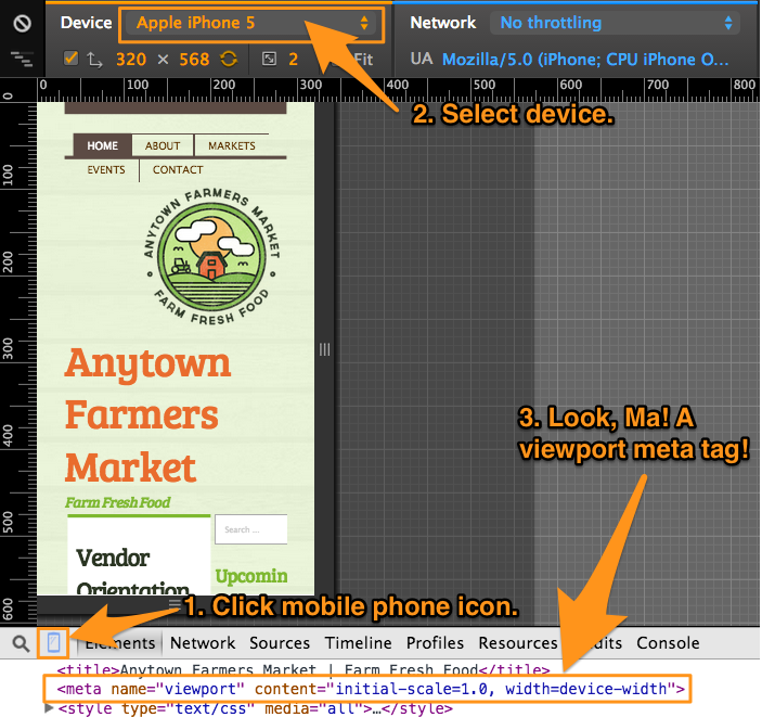
Enabling Responsive Layouts with Device-Width
Inside the content attribute of the viewport meta tag, the width=device-width tells a mobile browser how to handle the viewport sizing. Instead of assuming a wide width, like maybe 1280 pixels, causing horizontal scrollbars and forcing the user to pan and scroll to view all of the content on the page, this viewport meta tag tells the mobile browser that the width of the viewport should be the size of the device, regardless of portrait or landscape orientation.
By directing browsers, especially mobile ones, to use the device-width, we can now create media queries and change up our layouts and stack up our columns so that content is viewable in one vertical column, instead of panning around the page horizontally. Our relatively-sized region widths will now be relative to the device's width, instead of the much larger default mobile browser resolution. Our mobile screen will now be treated as the small screen that it is, instead of merely a window, or "viewport," into a much wider context.
In this tutorial, you learned how to enable responsive layouts in your theme by adding a viewport meta tag to your html template file. For more context and a demonstration, watch the free video, Adding the Viewport Meta Tag to html.tpl.php in the Getting Started with Responsive Web Design in Drupal series, now on Drupalize.Me.
Comments
in your code to be copied and place inside html.tpl.php, it uses initial-zoom. in rendered code below the picture, it shows initial-scale. Which is best and why?
Hi Craig, use initial-scale=1 (you actually don't need the decimal point version: 1.0) because that is the actual property name. It was a typo and mistake for me to suggest initial-zoom. (I got it mixed up because initial-scale controls the initial zoom level.) Thanks for pointing this out! I've corrected the copy-paste code in the article.