A Drupal single directory component (SDC) is Drupal's way of packaging the markup, metadata, styles, and behavior for a UI element in one self-contained folder inside a theme or module. This structure helps front-end developers and site builders keep all related files together for easier theming and reuse. A Drupal single directory component directory must be located in a specific place and its files named with a particular convention so that the system can discover it and use its assets.
In this tutorial, we'll:
- Show where Drupal discovers single directory components in your codebase.
- Explain the naming and organization conventions for Drupal single directory component directories and files.
- Outline key files for a component—both required and optional.
By the end of this tutorial, you'll be able to identify an SDC directory in a Drupal module or theme and know exactly what you're looking at.
Goal
Locate existing single directory components in a project and recognize the files inside by how they are named.
Prerequisites
- Drupal 10.3 or later
- Basic knowledge of Drupal theming and Twig templates. See the guide, Frontend Theming, to brush up on these concepts.
Why use single directory components?
In Drupal, single directory components improve maintainability by grouping all the files for a UI element in one place. This makes it easier to locate, edit, and reuse components, reduces duplication, and keeps your theming workflow organized—especially in larger projects.
What is a Drupal single directory component (SDC)?
A single directory component keeps everything needed to render a UI element—template, metadata, styles, scripts—in one directory. Drupal treats each component as a mini-theme asset that can be used in a template file by a front-end developer or by a site builder using the administrative UI.
Where does Drupal look for components?
Drupal scans every enabled theme and module for a top-level directory named components/. Every subdirectory of components/ that contains a .component.yml is treated as one SDC.
Here's a simplified example where Drupal discovers two components—button and card:
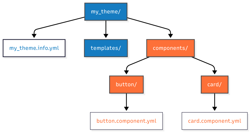
You can nest organizational directories—e.g. atoms/, molecules/, organisms/—between components/ and the component directory, but only the leaf directory—the one at the end of the path—containing a .component.yml file will Drupal treat as a single directory component.
my_theme/
└── components/
   ├── atoms/
   │   ├── button/
   │   │   ├── button.component.yml
   │   │   ├── button.twig
   │   │   └── button.css
   │   └── icon/
   │       ├── icon.component.yml
   │       ├── icon.twig
   │       └── icon.css
   ├── molecules/
   │   └── card/
   │       ├── card.component.yml
   │       ├── card.twig
   │       └── card.css
   └── organisms/
       └── featured-content/
           ├── featured-content.component.yml
           ├── featured-content.twig
           └── featured-content.css
├── my_theme.info.yml
├── templates/
│   ├── page.html.twig
│   └── node.html.twig
In this example:
- Drupal looks for components in my_theme/components.
- The components/ directory includes organizational folders like atoms/, molecules/, and organisms/. Drupal ignores these and instead scans for leaf directories with a .component.yml file, treating them as single directory components (SDCs).
Naming conventions for a component’s files
Use the following guidelines to name your component and its assets:
| Element | Naming convention | Why it matters |
|---|---|---|
| Component directory | Lowercase, kebab-case (my-component) |
Forms the component ID and file prefixes. |
| Template file | {component}.twig |
Required (for rendering). You'll get a PHP error if you try to use a component that doesn't have a .twig file. Must share the exact base name with its directory. |
| Metadata file | {component}.component.yml |
Required (for discovery). Without it, Drupal ignores the directory. May contain metadata and a JSON schema for props and slots. |
| Styles | {component}.css |
Auto-attached when the component renders. If you use Sass, PostCSS, or another CSS processor, have your build step output {component}.css into the component directory. |
| Scripts | {component}.js |
Auto-attached; wrap code in Drupal.behaviors if it interacts with the page. |
Main take-away: If you name your directory hero-banner inside your theme or module's components directory, Drupal expects hero-banner.twig and hero-banner.component.yml inside it. And hero-banner.css and hero-banner.js will be automatically attached (as an asset library) if they exist.
Referencing an SDC
Whenever you want to reference a specific SDC you'll need to know both the component name (taken from the component directory name) and the name of the module or theme that provides it—commonly referred to as the provider. The full name of a component is <provider>:{component}. For example, my_theme:button.
Inside a component directory
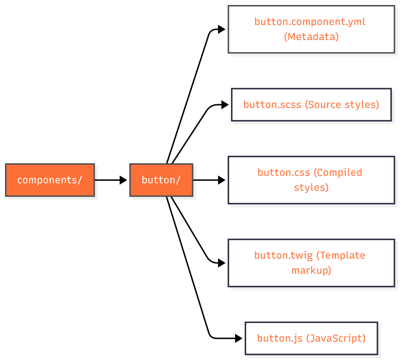
SDCs consist of a handful of files that follow a specific naming convention organized into a single directory nested in the components/ directory of a module or theme. For example, a component named button might have the following files:
- Twig file (button.twig): The template file that defines the HTML markup of the component. Note: The filename extension should be .twig and not .html.twig, as used in files in a theme's templates directory. Required.
- YAML file (button.component.yml): Contains metadata about the component—such as its name, props, and slots—and enables validation and IDE autocomplete. Required.
- CSS file (button.css): The CSS file contains the styles for the component.
- JavaScript file (button.js): The JS file contains the scripts for the component.
Other files: You may optionally include files like images or documentation (e.g., a README file) related to the component.
By grouping all these files in one directory, SDCs make it easier to find everything related to a UI element without navigating multiple locations, streamlining both development and maintenance.
Example common SDC directory structure:
components/hero-banner
  ├── hero-banner.component.yml # Metadata and schema
  ├── hero-banner.twig          # Template markup
  ├── hero-banner.css           # Styles
  ├── hero-banner.js            # Behaviors
  ├── README.md                 # Documentation
  └── screenshot.png            # Thumbnail for style guides
Organizing larger component libraries
When you accumulate dozens of components, grouping them into atomic design directories can help you and your team organize your components:
Example:
components/
  ├── atoms/
  │   ├── button/
  │   └── icon/
  ├── molecules/
  │   └── card/
  └── organisms/
       └── featured-content/
Note: The component ID for card above would be my_theme:card; the intermediate molecules/ directory is ignored in the ID.
Scaffold a new component
Ready to create a new component? Here's a quick checklist:
- Add a components/ directory to your theme or module (if it doesn't exist).
- Create a directory named after your component, e.g., components/alert/.
- Add alert.component.yml with
name: alertas the only content. We’ll cover full schema definitions for props and slots in a later tutorial. - Add alert.twig with markup.
- (Optional) Drop in alert.css and alert.js with matching prefixes.
- Clear caches and embed the component in a template file in your theme:
{{ include('my_theme:alert', {
  props: {
    message: 'Beep-boop!'
  }
}) }}
We'll provide in-depth details about these steps in the tutorials that follow.
Recap
Drupal automatically discovers single directory components inside a theme or module's components/ directory. Each component folder must include {component}.component.yml and {component}.twig, share a kebab-case base name across all files, and may include optional assets such as CSS and JavaScript (which Drupal attaches automatically), as well as other files like images or documentation. With this mental model in place, you should be able to recognize and navigate any Drupal single directory component library—or start scaffolding your own for your theming projects.
Further your understanding
- When looking at a components folder in a Drupal theme or module, how would you confirm that Drupal will recognize it as an SDC? (Learn how in Add a Component YAML File for a Drupal SDC.)
- Learn more about defining props and slots in Understanding Props and Slots in Drupal Single Directory Components.
Additional resources
- Using Single Directory Components: Quickstart (Drupal.org)
- OpenSense Labs: Drupal SDC overview (opensenselabs.com)
- QED42: SDC in Drupal 10 (qed42.com)
- Brad Frost on Atomic Design (bradfrost.com)