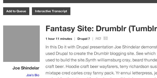
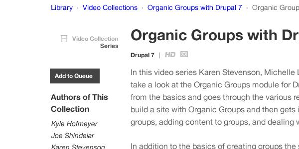
As some of you may know, we're in the process of upgrading the cuddly panda that we all know and love as Drupalize.Me to Drupal 7. There will be other blog posts giving a better insight into the actual upgrade but, I'll be talking about what that means for the design of the site. I've worked at Lullabot for about three months now and Drupalize.Me has become very dear to my heart. I like working on products like these, where you have great people using the site, interesting topics and a team dedicated to improving the experience. So, let's walk through a bit of the process that's gone into making the site better for you.
Design Survey
We thought it would be a good idea to survey you, our users. This turned out to be a great idea! In fact, I'd like to take this moment to thank you all who filled out our survey. This helped us in a variety of ways. First, it helps us see what things we could possibly remove. In design, there's a saying that goes, "Keep it simple stupid". You wouldn't imagine how difficult it is to stick to that advice. When giving a refresh to a site like this, it's easy to think, "You know, it'd be really cool if… [insert awesome feature here]". This survey helps me remove things that are clutter and not add pieces that would create it. Second, it helps us see what features can be accentuated. Over time, we have added many great features into Drupalize.Me. A recent one we pushed was a suggestion box. I really love this feature. It allows our subscribers to suggest topics we should be talking about and for the community to vote on these suggestions. However, after conducting the survey, I learned that there were users who had no idea this existed. In fact, one user even suggested it as a feature! As embarrassing as that is, it was clear to me that the suggestion box was in need of some design love. As you can tell, the survey has played a huge role in us creating a better Drupalize.Me.
Wireframes

This is the stage I'm currently in. I can't communicate enough how important these have been in our process. I’m using Fireworks to create wireframes and I absolutely love it. It allows me to iterate quickly and is a real time saver in the long run. Fireworks is almost like Photoshop and Illustrator meshed into one. It has vector and raster tools, allows you to select objects without going to the layers panel and has some tools that feel catered to the way the web works. This makes creating wireframes a lot easier, they look a lot nicer and making changes is faster. Having wireframes as part of our process allows us to have the right type of conversations at this time. We talk about functionality, layout, site organization, etc. All of these are design decisions and yet we haven’t even talked about the visual language yet. This is good. It helps us as a team to talk through the deeper problems we’re trying to solve, instead of whether a particular element is the appropriate shade of blue. Don’t get me wrong, that’s also important. Just not right now.

We’ve also been using a tool called Invision. This has turned out to be a great tool for both myself and the team. It allows the team to give very specific feedback all in one place. Before, I’d have to search through an email thread or comments on a ticket. Invision allows me to see feedback on specific elements and mark the comment as resolved when I’ve made the change in the wireframe or when a conversation has come to an end. Being that we’re a completely distributed team, Invision is another way that we’re able to involve everyone. A group of brains think better than just one. Invision has made getting feedback easy without wasting the time of the group. If you’re not using Invision, I highly recommend it.
Visual Layer
Since I haven’t actually made it to this point in the process, I’ll tell you about the goals I have for this part and what you can look forward to. One of the big aspects I’d like to address with this upgrade is the typography. Some of the type around the site isn’t all that readable nor does it establish a clear hierarchy within the page. Really, the content of Drupalize.Me isn’t around type, it’s centered around videos. However, I want to make it as easy as possible for you to find what videos are about and get to learning! Other than that, the other visual changes will be more polish than anything. I’ll be playing around with the colors, texture and icons to make the site easier to use and feel less cluttered. You’ll definitely feel the difference. We’re looking forward to finishing this upgrade and showing you all the hard work we’ve been putting into it. As always, thank you for using Drupalize.Me and your continued support.
Comments
It's always interesting hearing how a site you use is being built. Looking forward to the new design.
Add new comment