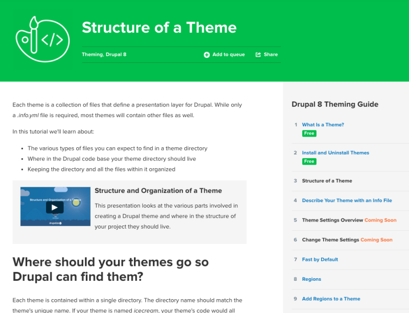
We've been working hard to improve the navigation on our new tutorials. Today we released a new and improved design that makes navigating tutorials much easier. See it in action in our Drupal 8 Theming Guide.

If you've been soaking up knowledge about Drupal 8 theming or configuration management, you probably noticed a major change in navigation on our new tutorial format. We solicited feedback from you and heard that navigating the new tutorials was confusing.
We agreed, and we've been working on incrementally improving the design. Today we released the first set of improvements which displays the navigation on the right side or at the very bottom on small screens. We hope this change makes navigating our ever-growing Drupal 8 Theming Guide and upcoming Drupal 8 Migration Guide easy.
More improvements are in the works. We've been working hard to create the best Drupal 8 training material, and we want it to be easy to navigate.
What do you think? Are we headed in the right direction? Let us know what you think about our new navigation in the comments or contact us directly.
Add new comment