As a tutorial and documentation writer, UX writing is not at the top of my task list, but it’s adjacent to the work I do on a day-to-day basis, and is definitely something I’m interested in learning more about.
All those bits and pieces of words -- on labels, buttons, navigation links, error messages, and confirmations -- it turns out they’re really important! They communicate to the user where and how to interact with a site, and the results of actions they’ve taken (among other things). These little messages also tell the user a lot about the company behind the site or app.
UX writers are folks who pore over these messages, tweak them, test one version versus another, and write them to hopefully convey an accurate message at the right time in the proper tone. There’s a lot to think about in the area of UX writing, a lot of pitfalls to avoid, and opportunities to explore as well. Fortunately, there are a host of books, articles, and even conferences dedicated to this discipline.
Recently, our marketing coordinator Philippa Stasiuk and I attended the online UX Writer Conference. I heard about it through the Write the Docs Slack community grapevine. (By the way, Write the Docs is a conference for technical writers I heartily recommend.)
The schedule was packed to the brim with sessions, networking, and booth-visiting opportunities, all taking place on the Hopin platform, one of the new “normals” of online conference attending. (DrupalCon, Write the Docs, and BADCamp took place on Hopin as well.)
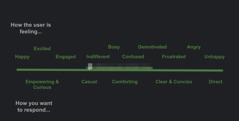
My main takeaway from the conference was learning about concepts that I would like to take a deeper dive into. “Tone” in UX writing is one of those topics. I caught 1 of the sessions on tone (there were several) and this was my favorite slide. It shows a spectrum of emotions the user may be feeling and a corresponding tone that you as a UX writer should employ in the messages to the user when they are probably feeling a certain way.

A slide from Nicole Michaelis’ UX Writer Conference presentation: Tonality — When, Where, and Why?
Nicole gave several great examples, such as how to improve the tone of a message when a customer has just signed up (user is feeling excited) or when their free trial is almost up and you want them to consider signing up and paying (user may be feeling a range of things like busy, demotivated or frustrated).
Incidentally, the presenter, Nicole Michaelis has a podcast I’m looking forward to checking out: Content Rookie: A Podcast on All Things Content.
In another session I attended, Accessibility, Diversity, Equity, and Inclusion: UX Writing for Divergent User Bases, Natalie Dunbar shared a number of helpful resources on discovering cognitive biases, including:
- Technically Wrong by Sara Wachter-Boettcher
- 52 UX Cards to Discover Cognitive Bias
- Conscious Style Guide
- Design for Cognitive Bias
Philippa's takeaways were less about the applications to Drupal and the way we’re teaching it, and more to do with how to optimize the way we connect with our customers, site visitors, social media followers, etc. Here’s hers:
As someone who comes from a writing background, I was very interested — and glad — to see so many people who have specialized in UX writing coming from journalism with its direct applications to UX writing via editing, fact checking, and always leading with the most important information.
That was the case with presenter John Caldwell, who spoke about crafting content that connects customers by building trust and loyalty using three key elements:
- Character: your brand, your core values -- what your company is about
- Voice: how you bring that character to life -- where the customer relationship is created
- Tone: mood, emotion -- more momentary language that addresses what’s happening now and in context
Building voice and tone upon character are core strategies to demystify complex topics, (which is more Amber’s job), but they’re also relevant to what I do, which is to shepherd a brand that’s built on meaningful connections.
Another key topic that I found relevant to both how we teach Drupal and how we engage with our customers was the importance of empathy. Through the various workshops, the idea of being actively empathetic — that is, putting yourself in some else’s perspective, in the micro moments that make up everything from UX design and tutorial making to social posts — is key. It’s something through which everything we create and say should be filtered (and honestly, something we could use a lot more of in the world in general).
If you found this intriguing, it looks like the UX Writer Conference is happening again online in February 2021. More details on their website, https://uxwriterconference.com/.
Add new comment